(Including Two Crucial Steps That Most People Skip)
Running a Regression in Excel is fairly easy. So is running one incorrectly. There are two crucial steps that should always be performed on the data before any Regression should be run. Fortunately these two steps are very quick and easy to do in Excel. They are:
1) Graph the Data
2) Run Correlation Analysis On All Variables
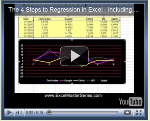
Following is a video of this article showing how to perform all four steps to Regression in Excel, including the above two crucial steps at the beginning:
(Is Your Sound and Internet Connection Turned On?)
Why You Need To Run The 2 Crucial Steps Before Doing Regression
Here’s why you need to run the two crucial steps prior to regressing any data in Excel:
Whether or not you are using Excel to run a Regression, you should always graph the data before doing anything else. Eyeballing the data will allow you to quickly determine whether there is any relationship between the independent (input) variables and the dependent (output) variable. You also want to evaluate whether the graph generally appears to be linear or possibly quadratic. Excel’s Regression Tool works well only for reasonably linear data. Eyeballing the data upfront will tell you very quickly whether Excel’s Linear Regression is the right tool for the job.
Graphing The Data To Check If It Is Linear
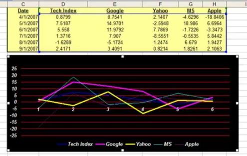
The input and output variables will be graphed together. The y-axis of the chart will provide the scale for plotting of those values. The x-axis will provide a measure of whatever continuum was used, e.g. time, to collect the values of all of the variables. Excel’s charting function is the way to go here. The above linked video shows exactly how to chart all the data in Excel.
There are two good reasons for doing this. First, we want to remove any input variables which are clearly not good predictors of the output variable. Second, we want to make sure that none of the input variables have a high correlation with (are good predictors of) other input variables.
Running Correlation Analysis on the Data To Prevent Collinearity and alsoTo Remove Input Variables That Have Low Correlation With the Output Variable
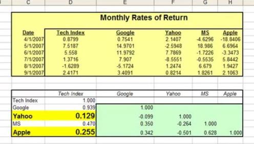
Correlation of multiple variables is easily done in Excel using the Correlation Data Analysis tool. The linked video shows exactly how to do that.
After you have run Correlation Analysis on the data, you will want to remove any input variables that have a low correlation with the output variable. A Correlation Coefficient of with an absolute value of less than 0.4 (between -0.4 and +0.4) between the output variable and an input variable indicates that the input variable is not a good predictor of the output. That input variable should be removed from the Regression Analysis. The attached video provides an example of this.
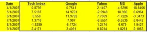
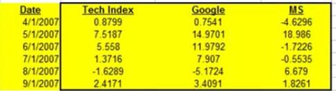
Data Columns Before Removing Input Variable With Low Correlation To Output
Data Columns After Removing Input Variables With Low Correlation To Output
After looking at the Correlation Coefficients between the input and output variables, look at the Correlation Coefficients between the input variables themselves. You do not want to use pairs of input variables that are good predictors of each other in a Regression. This will cause a Regression error known as Collinearity or Multicollinearity. One variable from any pair of highly-correlated input variables should be removed prior to running the Regression Analysis. Variables can be considered highly-Correlated if the absolute value of their Correlation Coefficient is greater the 0.7 (greater than +0.7 or less than - 0.7).
Here are a few hints about adding new input variables to a Regression Analysis:
First, build up a Regression by starting with a small number of input variables and add any new ones one at a time. Second, good new input variables noticeably increase Adjusted R Square and also lower Standard Error without significantly changing the existing Regression Coefficients.
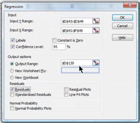
When you are satisfied with the output of the data graph and the Correlation Analysis, go ahead and run the Regression with Excel. An example of how to do this is shown in the above video.
The Excel Regression Dialog Box
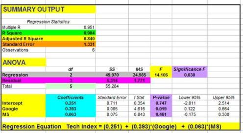
The final step of Excel Regression is Analysis of the Excel output. Please refer to the chapter of this manual that goes into detail about how to quickly read and understand the output of regression done in Excel.
Excel Regression Output With Color Coding Added
Conclusion - Plotting the Data and Running Correlation Can Be BIG Time Savers
Plotting the data and running Correlation Analysis prior to running a Regression can save you lots of time that you might otherwise have to spend making adjustments to your Regression after running it.